 Confusion, headaches, frustration, anger, hopelessness, sadness, depression and resentment. Those words probably best describe my first two days with this new software.
These are not emotions commonly associated with creativity, artistic output, joy, happiness or inner fulfilment.
And I had such high hopes for ZBrush! My capability of wanting to learn, the excitement of exploring new territory and the certainty that sooner or later I’d be able to figure it out were no longer with me.
Plus my usually reliable learning resources weren’t able to teach me the basics!. For a moment there I lost all hope.
Then I discovered that there may be light at the end of a very dark tunnel after all. Let me tell you all about it in the first part of this exciting new series or Learning Zbrush.
Culture Shock: The User Interface
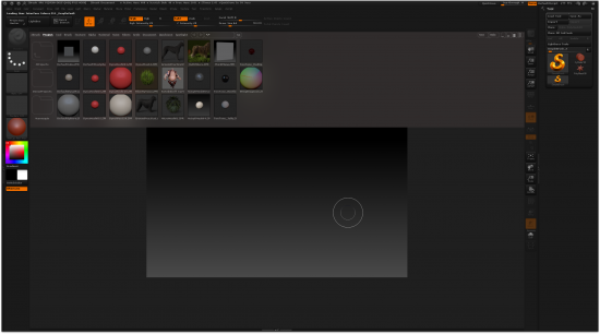
When I first opened ZBrush the app greeted me with a colour scheme so dark, light cannot escape my monitor. I’m serious here! Dark grey text on a 100% black background. Apparently that’s the “new default look” in ZBrush 4.
Of course this can be changed, and thanks to a couple of buttons on the top right you can step through a few other colour choices:
- pitch black
- dark dark grey
- dark grey
- dark grey with a green tinge
and a few others. I’ve settled on something like dark grey which I understand was the default in ZBrush 3. Much easier on the eye.
With the first problem of actually deciphering what’s on screen out of the way comes the second problem: SEEING what’s actually on the screen.
As a long time computer user I’ve come to expect certain conventions from every piece of software, and no matter which operating system you look at, all Graphic User Interfaces have certain menu items in common (such as File, Edit, Window, Help, that sort of thing). They also have in common that there IS a menu at the top screen.
Forgive me if I’m a bit shocked and taken aback to discover that the $800 software I’ve just bought does not follow that convention. Instead, I’m counting as much as EIGHTY random words and icons on the screen (not including icons in the Lightbox).

Questions arise: How would I import an OBJ file, without there being a File – Import option? How would I save my work? Where is the HELP menu?
I’m sure it would become clear eventually. Let’s keep in mind this is an “artistic interface”, made for creatives who don’t want to bother with technical clutter (hence the 80 menu options I guess).
So I eagerly grab my stylus and start drawing. Or sculpting. Or just waving it around in an agitated state of panic.
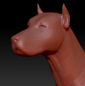
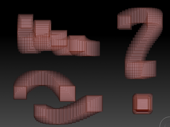
All I seem to be able to produce are a rows of red squares. Are those 3D yet? Is it political? What’s going on here?

We’re going to need a bigger Manual, Roy!
I didn’t think I was getting anywhere by trial and error. Surely for $800 there’s a manual included… or is there?
‘fraid not, Ma’m! ZBrush comes with a couple of written manuals: a “Starting Guide” and a “Getting Started Guide“, plus 8 shorter documents describing “What’s New” for the last 8 version of the software. I also found 8 other short documents about “plugins”. That’s 18 documents I need to sift through – perhaps I’ll do that later. Maybe there’s a video tutorial that will get me started.
There is a full online manual available though – something the home page doesn’t link to.
Hello, Lynda… anybody home in quality control?
I’m a Lynda.com Premium Subscriber which has helped me in the past on so many complex issues. Julia and I were in fact watching a course on Sculptris just the other week, and lucky for us there was a ZBrush course by the same author. Let’s go check it out.
Half an hour passes and it becomes quite clear that THAT course doesn’t really teach you anything about ZBrush. It says it would, but all the author does is demo the possibilities of ZBrush, rather than explaining how to make them happen. #FAIL
We’re glad to find that there’s a five year old ZBrush 3 course by a different author which looks more promising. It starts out really nicely, explaining the core concepts behind ZBrush, until it becomes clear that the course is dramatically out of sync: the instructor is talking about something that only a minute later appears on screen! By that time of course he’s talking about something completely different.
While I like the instructor, a bit of QA does go a long way – no matter how much venture capital funding you’re getting. Not exactly what I need for $375 per year… #EPICFAIL
I could go on bitching about how the interface colours aren’t saved when you re-open ZBrush, or how I’m still put off by not having a File – Import function… or that there are THREE ways of saving something in ZBrush and what’s up with that… or I could just skip that part and go straight to some success stories and interesting concepts of ZBrush.
In fact, let’s do that instead, shall we?