![]() On Speak Like a Pirate Day 2013, the 18th of September, Apple decided to release their latest and (apparently greatest) operating system for iPhones, iPads and iPod Touch devices: iOS 7.
On Speak Like a Pirate Day 2013, the 18th of September, Apple decided to release their latest and (apparently greatest) operating system for iPhones, iPads and iPod Touch devices: iOS 7.
Developers like me have had it since June and we were eased into what may well be a culture shock to many users. We were not allowed to talk about iOS 7 until today due to the non disclosure agreement that comes with the territory of using pore-release software.
Because I’ve been using iOS 7 for the last few months, I can finally tell you what’s changed, what’s better and what’s perhaps not so good about the latest release. Even if you’re itching to press that upgrade button, have a read and get into the mood.
History: iOS 5 + 6
I must admit that I had my doubts about iOS 6. I didn’t upgrade when it came out. I had seen the beta versions and really didn’t see the point – everything looked the same, and the few minor changes that it brought over iOS 5 weren’t worth it to me. Besides, removing good things that you’ve come to rely on (such as Google Maps) and replacing them with “alternatives” isn’t what I signed up for when I bought my device.
All I knew was that I would have been lost compromising a device I relied on every day – having just moved to a new country, you start thinking dofferently about things necessary for survival. You cannot risk certain things.
Then I read an article that said iOS 6 was more about Apple than it was about its customers. So for many months I just didn’t upgrade. I had my iPod touch on iOS 6 which was great for development, but my iPhone remained iOS 5. When I finally took the plunge, I thought that the best feature is the “Do Not Disturb” function. Other than that, not a lot else was new from a UI point of view.
Enter iOS 7
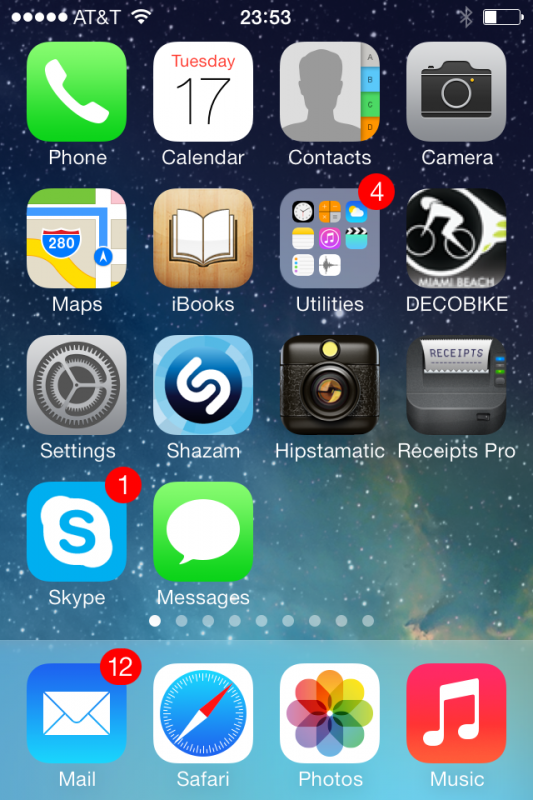
This changed with the latest release: everything looks completely different and all UI elements have changed. If you didn’t know any better you’d think you’re looking at an Android or Windows device. Punchier colours, larger icons, moving springboard backgrounds – and old favourites such as Calendar and Reminders have been redesigned completely.
From a developer’s point of view that’s a huge challenge – luckily there’s a trick that can make existing apps look just like iOS 6 apps, so technically your upgraded devices know both styles – old and new.
A bigger challenge is that the development software we’ve been using, Xocde, has seen a major overhaul so that we can develop apps with the new look and the new features. Plus, two new devices are due to be released. It’s exciting – and exhausting at the same time.

What’s new in iOS 7
Here are a few things I found out the hard way, things that have changed that I’ve come to rely on. For example, the Search Function. Spotlight Search it’s called, and usually that’s the page on he very far left next to all your apps. That page is gone.
How to search / How to close apps
You no longer have to swipe there, or press the home button twice, then swipe right. Instead, swipe DOWN from the middle of the screen – any screen – to reveal the search bar at the top. It’s an improvement – if you know it’s there. You even get a notification about this once you upgrade (something beta testers didn’t have).
Closing running apps has also changed a bit. You can still double-tap the home button, but no longer will you see the bottom bar with running apps. Instead, you’ll see small screenshots in the middle of the screen. Swipe them up and they’ll disappear (and be closed if you hasn’t guessed).
And speaking of the bottom bar when pressing the home button twice: you could slide it to the right, revealing a menu that would let you control volume, screen rotation and AirPlay mirroring. That menu is gone as well, it’s been integrated into a new one that has a lot more functions.
Shortcut Menu
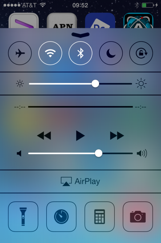
I’m not sure what this thing is actually called, but when you swipe from the bottom of you device upwards, you’ll reveal what I’d like to call the Shortcut Menu. It has anything you needed a lot more touches for under iOS 6:
- toggle Wifi / BlueTooth / Airplane Mode / Rotation / Do Not Disturb
- switch on a torch (your rear flashlight)
- control screen brightness and volume
- set a timer
- use your calculator
- use your camera
- switch on AirPlay mirroring
Very handy indeed! Remember: swipe up from the bottom of the screen to get there.

Notifications Menu
You can also swipe down from the screen to bring up the Notifications Menu. This tells you what date it is, what the weather’s like and everything else that can send you push notifications (calendar, reminders, your favourite games, Facebook friend suggestions of people you will not ever want to be connected to, etc).
It’s very similar to what used to be in the same place in iOS 6, with a couple of omissions: this menu no longer includes the option to write a Tweet or Facebook message. Which I find sad, and I haven’t found a way to bring up those “tweet sheets” any other way, without opening the actual app you want to send from.
I enjoyed the function: something pops into my head, swipe, type, tweet. Not sure why that’s gone, but gone it is.
Automatic App Updates
Yep, they’re here – wake up to automatically updated apps if you choose. You can switch this off too, in case you’d like to stay at a particular version. It does work very well too, so no more “67 updates available” icon (like on Ray’s phone).
It feels “lighter”
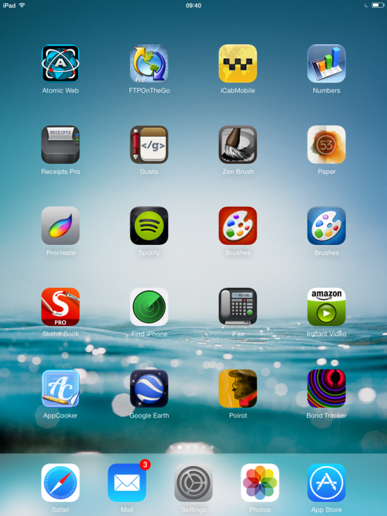
I won’t bore you with trivialities like moving backgrounds or half-translucent menu bars, but I have noticed something that’s perhaps difficult to put into words. There’s a “feel” to iOS 7 which I do enjoy. It’s particularly noticeable on the iPad. It’s almost effortless to use, more so than before.
I can’t quite explain it, but it seems iOS is getting out of the way, and focuses better on “what” rather than “how”. It’s of course up to developers to make their apps fit in.
iPhone apps scale way better on iPad 2 devices than they did before. I have both an iPad 2 and iPad 3, and iPad 3 scaled iPhone apps look smooth and just bigger. On iPad 2 those always looked blocky, and since it’s done with software I never quite understood why. In iOS 7 iPhone apps look super smooth when you run them on iPad 2. Also, the x1/x2 button is gone, they always display full size. That’s good!

Transparency fix for images
There sued to be a rather annoying bug in iOS, ever since it came out: when you save an image that contains transparency to your camera roll, the thumbnail would look all wonky. Behind the scenes, iOS added some other image to the thumbnail so you couldn’t see what your actual picture was. When opened, the picture was fine – but the thumbnail was not.
This is extremely annoying when you’re drawing something in Sketchbook Pro or Paper and want to export the image – without background – to another app.
Lucky for us all, iOS 7 seemed to have fixed this from what I can tell.
Should you upgrade?
Actually YES – iOS 7 feels fantastic, and most of what we liked is still there. I’ve seen plenty of apps during the beta testing that did not work, but that was months ago and all the ones I”m using are working just fine. From what I can tell battery life is the same too.
Especially iPad and iPad 2’s look and feel great with iOS 7. It feels like you’ve got a new device.
Bad news for those who have any of the following, as these can’t be updated:
- iPad 1 (stuck on iOS 5.1.1)
- iPod Touch 4 (stuck on iOS 6.1.3)
- iPhone 4 (stuck on iOS 6.x)
- iPhone 3GS (stuck on iOS 6.x)
A word of caution though: if you are relying on several apps for your business (or your life), and those stopping is NOT an option, then I strongly advise you not to upgrade yet, or alternatively test your favourite apps on a mate’s device, or your “spare” if you have one. Don’t get caught up in the rush that you “have to”.
More to read
For all the gory details about iOS 7, check out Apple’s iOS Page – it’ll tell you all about it.
And for the impatient among you, rumour has it that iOS 7 will be released sometime in the morning Cupertino time – that’s during the late afternoon/evening in Europe, and lunchtime on the Eastern Seaboard (arrrrr… shiver me timbers!)
Help! I’ve updated to a dodgy Beta Version weeks ago (when I shouldn’t have), and now my device stopped working…
Unless you’re a developer, you shouldn’t have done that. Period.
That said, even developers are in that situation at times. What you’ll need to do is put your device into DFU mode and re-install the firmware image. I’ve written an article about this.
Enjoy the new look!
Thanks Jay, very useful indeed.
Glad you like it 😉 I’ve added some screenshots now too, and a link to Apple so you can see all the new features at a glance. Rumour has it they’ll release it around 10am Pacific Time, that’ll be sometime in the evening in Europe.