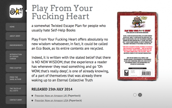
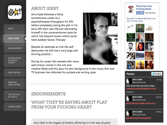
 I’ve finished a new website last week for my friend Jerry Hyde. We go back at least 15 years, and I’m excited to tell you that Jerry has written a new book that will be released on July 25th.
I’m not swearing when I tell you it’s title: Play From Your Fucking Heart.
It’s a self-help book with a spin: the author acknowledges that there is no “new wisdom” to be told – instead every piece of philosophy is recycled and indeed old news.
Jerry doesn’t say that this makes it invalid or untrue – quite the opposite: fact is that we as readers already know all these wisdoms, and merely recognise them as significant when we see them presented in yet another package.
It’s Genius! You can find out more about the book here – and don’t forget to put your pre-order in on Amazon!
The Website
I’m extremely pleased to have been involved with this project, and I’m very happy with the way it turned out. It makes such a difference when you work on something that you believe in – something I have the luxury to do exclusively these days. Let’s face it: it’s the number one reason that I live where I live today.
Naturally the site is build on WordPress and went live just as version 3.9 came out.
Jerry wanted something “dark” and likes unusual designs. Because the calendar says it’s 2014 we also needed a template that looks equally nice on a phone, a tablet and a laptop. After looking through several options I showed him AppifyWP Single – a theme that’s meant to be used as an App Website.
Not many changes were necessary, however I do make it a habit of creating child themes for my projects in case the original codebase ever gets updated.

The few things I did change were references to the fact that we’re selling an app: Jerry didn’t want like his book cover hovering on an iPhone so I’ve replaced it with a grubby old book cover – courtesy of Graphicstock.com. I also removed the “Download on the App Store” logo and replaced it with the release date.
One thing I did not want to change about the theme was its App Icon – but because books don’t have App Icons I had a look at the cover image and got creative with the blanked out swearing bit. In case we ever write an App with “Jerry’s Wisdoms” we’re covered already. Imagine a Magic Eight-Ball type app.
Site Functionality
The theme is special in that all “tabs” on the left are WordPress pages, but all of them are presented as one long block of text, and each tab is merely an anchor point to a new position. It’s like a bookmark system – thanks to the ingenuity of its designer Cory Show who developed AppifyWP.
Therefore the order of those tabs was important – the pages need to flow, like the book itself: we start with a quick introduction, tell you about the author, give you endorsements, the foreword and a reading sample. The reader doesn’t need to know the techie bits in the background, but s/he can certainly tell when they’re not right.
We also invite readers to have a look at Jerry’s other projects, like his website as well as his previous two books (and where to buy them). While scrolling through all this content, both the menu bar with navigational tabs and the sidebar with Social widgets sticks in one place so there’s always something new to discover.
Jerry also writes a monthly column for Seymour Magazine – so it’s easy to pull in his feed via the wonderful FeedWordPress plugin by “RadGeek” Charles Johnson: every time a new article in Jerry’s category is published by on Seymour Magazine, we syndicate it with teaser content and link back to it on the originating site. Automagically.
