
Remember that bike app I’ve told you I wanted to write? I wanted to track all the miles we’re doing on our new bikes.
The app store has plenty of such apps already, but some of them are so complicated that it takes years to figure out how they work. I wanted to create something simple instead and went to work immediately.
I have to tell you it took a couple of weeks of tinkering and learning some new skills. In the end it wasn’t as easy as I thought it was going to be, but I’m proud to say that yesterday I’ve submitted Bike Tour Diary to Apple. Let’s see if they like it!
It’s been four months since I’ve submitted an app (which was TALK! – the speech synthesiser). Funny how quickly the brain forgets important steps and leaves you clueless. Let me tell you all about the writing process, what the app does and what features I’m working on next.
Important Features
I deliberately wanted to write something that does not track your bike journey as you’re cycling. As funky as that sounds, it drains your battery and is exactly the opposite of what you want when you’re 20 miles away from home on your bike.
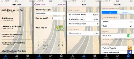
What was more important was a super simple interface that would let me enter a title, a date and some mileage. Naturally we want some stats, so the app needs to add up all the miles a bike has done and perhaps display a graph of some kind, such as “how many miles a month” we’ve done. And because I knew my friend in Germany wants to use this app too, there had to be an option to switch between miles and kilometres.
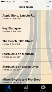 The plethora of devices I’m using is quickly coming up to “countless” so there needs to be a way of synchronising my journeys across my iPhone and iPads, perhaps even my Mac. iCloud springs to mind of course! I had successfully implemented iCloud key/value storage before, but because this app was going to use Core Data as a storage engine, iCloud is a very different beast to implement.
Other than that I wanted a way to remember where we’ve been. The easiest option was to add a picture to each journey, such as a screenshot from the Maps application. While simple it’s also lame and doesn’t actually show the route you’ve taken.
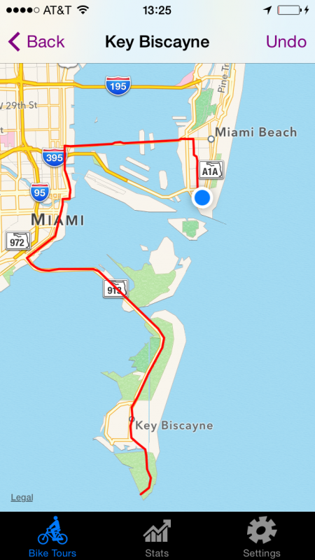
A Map View inside the app would be much cooler, which would allow me to draw a route by setting waypoints that would then connect so that they make up a route. Even though we’ve all used this functionality many times before (or so it would seem), it’s not actually that simple to implement.
And finally I wanted the app to be compatible on iOS 5, iOS 6 and iOS 7 – because it’s one of those tools that could be really useful on older and forgotten devices. iOS 6 is still supported by the Apple development tools, but iOS 5 has been pushed away now: developers no longer have access to the simulator, but my wife’s iPhone is still rocking iOS 5 – at least that’s something for debugging.
Here’s a list of things I’ve taught myself for this app and some notes I’ve taken along the journey:
- How to build apps for iOS 5 with Xcode 5.1
- How to use Core Data with iCloud
- How to tear down your Core Data Stack
- How to let the user set a pin on your MKMapKit Map View
- How to draw an MKPolyline on a Map View
Writing the app
The initial working prototype was done within an afternoon.
iCloud took another few days of research, and it turns out all I needed was two lines of code (that literally nobody on the internet – including Apple – tells you about). In fact, I’m thinking of writing another book: Julia suggested the apt title “Two Lines of Code and no one tells you”. More about that in another article.
The Map View took a bit of work because setting pins and drawing a route is not something that’s provided by the MapKit framework, but after a bit of testing it now works beautifully – including an “undo last pin” function.
What took the bulk of time was to prepare the app for “general release” and make sure it doesn’t crash when used with fringe cases: what happens when the user signs out of his or her iCloud account? What happens when you start drawing that map before adding a title? Why is your bike tour saved when you haven’t entered anything? That sort of thing.
There is a big difference between creating an app for yourself, but quite another to make it App Store ready. As it turned out that took the bulk amount of time.
Auto Layout was another huge headache. It’s something that – in theory – makes every button / textfield / etc appear in the correct position no matter how long/short/wide/fat the screen is. “In theory” means it’s a system that looks good on paper, and the dude who’s devised it never had to use it outside a demo app. Read: Auto Layout doesn’t frigging work and sucks so very very very very very much. In the end I simply didn’t use it.
Graphic Elements

Thankfully Julia signed up to Graphicstock.com earlier this year. This gives us access to billions of little clip art images that come in handy for projects just like this, as well as making websites and random articles look gorgeous.
We needed an App Icon and something like a background texture and found both. We then had to re-factor this into 56785 different sizes – because the development tools are too thick to do this automatically. This wasn’t a problem before the introduction of different screen sizes, but now that iOS 5/6/7 demand different icon sizes it’s getting just that tad ridiculous.
It is rumoured that in June we’ll hear about a new iPhone and iOS 8, which will undoubtedly introduce at least one new screen size. Perhaps they’ll figure out a way to make you upload one icon which will be resized on the fly. We live in hope.
In App Purchase Model
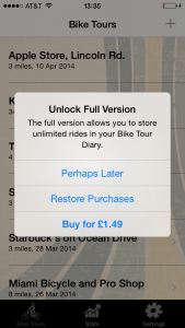
I’ve decided to release the app for free. That way users can test drive it with no obligation. Even the worst app gets hundreds of downloads every month – if it’s free.
If you add even the lowest price tag people are reluctant to try it out – even though you can get a refund from Apple if you ask nicely (we trust Amazon to do this, and Apple are just as nice, just go and ask them).
An In-App Purchase lets users pay later if they like the app with no risk, and Apple say it’s the most popular revenue model on the App Store today.
For something so “popular” it’s surprisingly difficult to implement though! The official documentation doesn’t make it any easier either. Thankfully last time I’ve implemented this model I took some notes. Time and time again I find that it’s vital to document everything I’m doing, or I’m lost two weeks from now.
So in this app, five Bike Tours can be saved for free, any additional tours can only be saved in the Full Version. The price tag is lower than a Double-Chocolate-Chip Mocha Latte with hazelnut sprinkles.
Future Features
I can think of a number of additions I’d like to make – aside from bug fixes.
For example, in Version 1.0 the iCloud feature only works on iOS 7 devices – due to the way Core Data is synchronised in previous versions. It technically works on iOS 6, it’s just not very reliable. That’s due to the framework, but users won’t really care – all they see is “the app doesn’t work”, and unless I can at least make that clear I’ll hold off on it.
Sadly iOS 5 won’t get this feature as Core Data was not working with iCloud when it first came out in 2011. Hence a Backup/Restore feature is on the cards that will allow us to import/export a file with iTunes Connect or Dropbox. It’s always a good idea to keep vital data safe somewhere – especially during testing. I constantly stand a chance of wiping out my own bike tours!
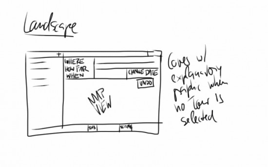
Right now the app does not have a proper iPad interface. I’m planning something like this (it’s an early sketch I devised on the beach yesterday):
 Speaking of import/export, I have plans to bring this app to the Mac too!
The development tools are essentially the same, even though there are differences between frameworks on each platform. For example, touch events in iOS do not translate seamlessly to Mac OS X. However MapKit and Core Data are very similar if not identical.
It’ll be another challenge 😉
Availability
Right now the app is with Apple for review, they may decide it’s good enough for the App Store – but then they may not. Review may take a week, sometimes it happens quicker.
Watch out for a release post over at Pinkstone Pictures when it happens (I’ll amend this article if I remember…)
1 thought on “That Bike App”