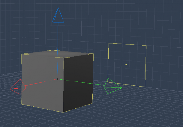
You know those grids in Carrara that often get in the way? Those that only appear in the viewport and not in the final render. The ones that show you the outlines of your objects in yellow:

Sometimes you can’t see your scene with too much clutter. And I keep forgetting that there’s a super easy way to switch these grids off.
Cast your eye to the to of the viewport and find the following icons:

See those three little grid icons? Click any of them to make it disappear in the viewport. It’s that easy! Disabled grids turn dark, enabled ones are lighter in colour:

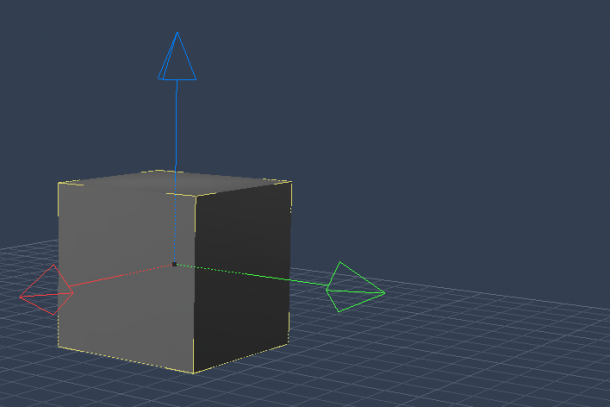
With the side grids switched off, the scene looks less cluttered.

Sometimes I forget how user-friendly Carrara can be 😉