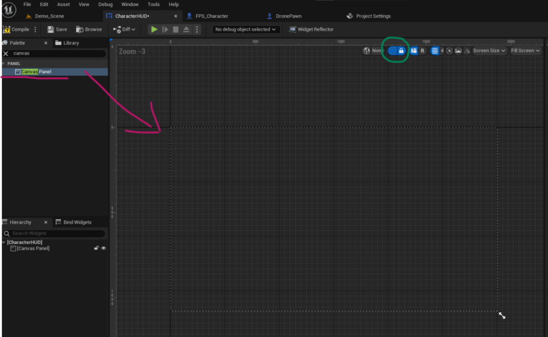
Creating my first HUD widget in UE5 was a little disconcerting, as I didn’t see a reference to where any of my UI elements would end up on screen. Turns out there was an invisible default element called Canvas Panel in previous versions, into which we would place our UI elements. Thankfully this thing is still available, but we have to add it manually. Search for it and drag it onto he canvas.

Now we can arrange UI elements inside this grid and get an idea of how they will look when rendered. Notice the little square icon at the top right, with which this frame can be toggled on and off. Sanity has been restored!
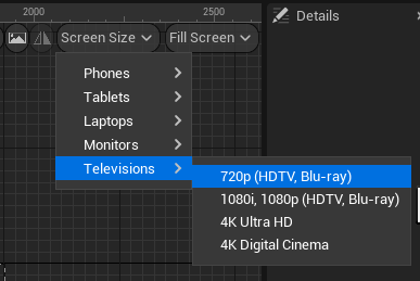
I suppose this change was made because the classic 16:9 screen isn’t the only format in town. We have phones, odd rectangle designs like 16:10, 4:3 and ultra wide shenanigans, all of which UI designers may want to cater for. Take a look at the Screen Size drop-down and notice that the shape of the canvas panel changes depending on what you set there. Apple faced as similar challenge (and completely ruined how Xcode handled automatic positioning of UI elements) when new iOS screen sizes where introduced.

To cater for “classic UE4 look”, set the drop to Televisions – 720p.