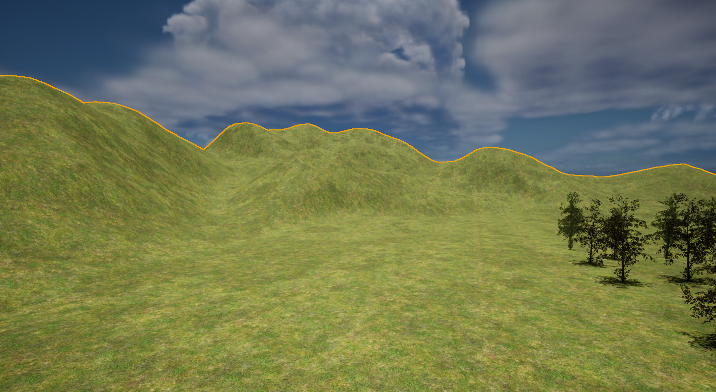
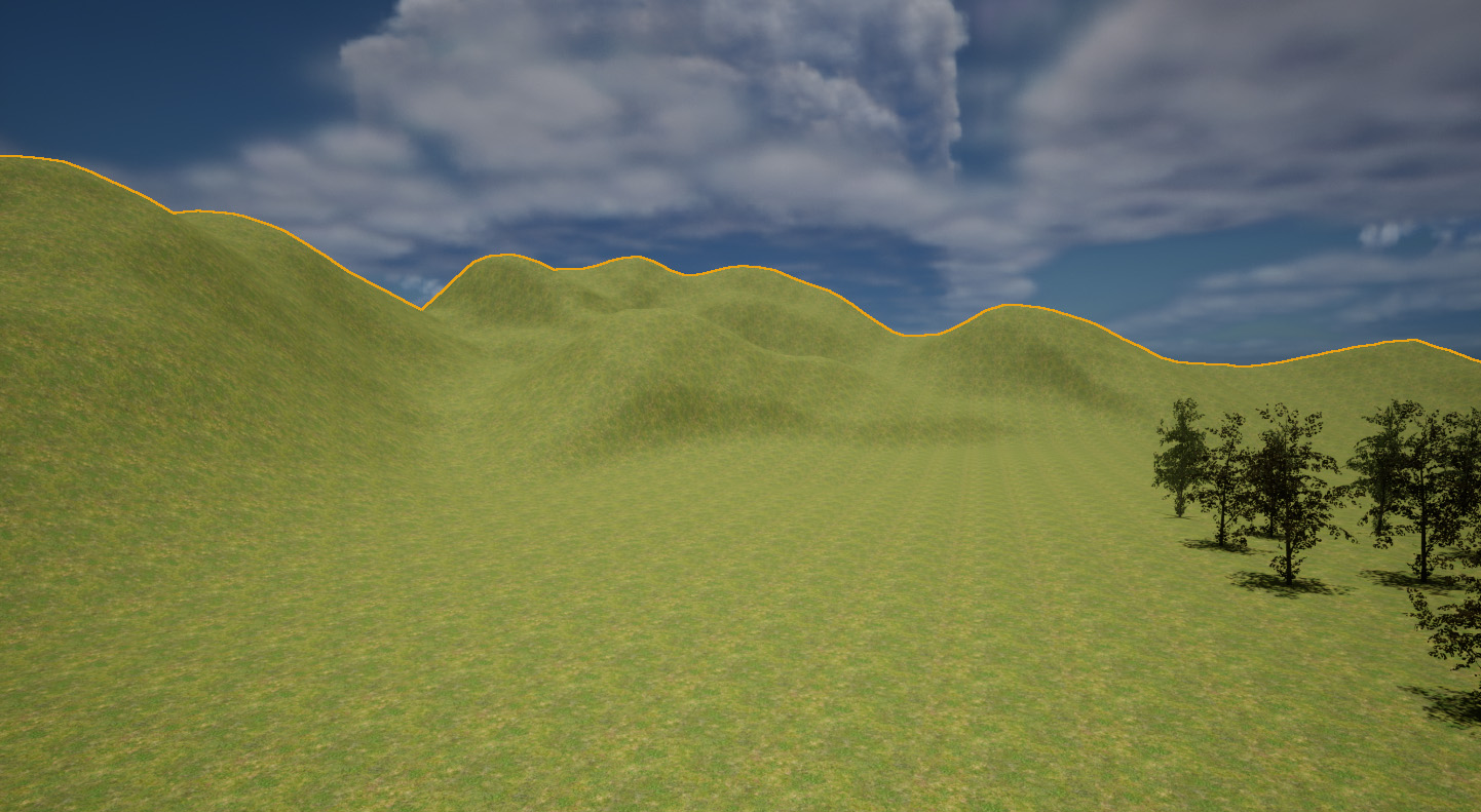
We can spot tiled textures a mile off, and it’s tricky to avoid this effect on large pieces of geometry like landscapes and oceans. Thankfully there’s a relatively easy trick that can add some variation to the mix with Macro Variations. Those patches on the left hand side of the above image show that with a little bit of visual breakup, our eyes no longer perceive the same texture as tiled. Here’s how to setup such a material in Unreal Engine.
The simplest material for a landscape is to add a single tileable texture onto it, much like this:
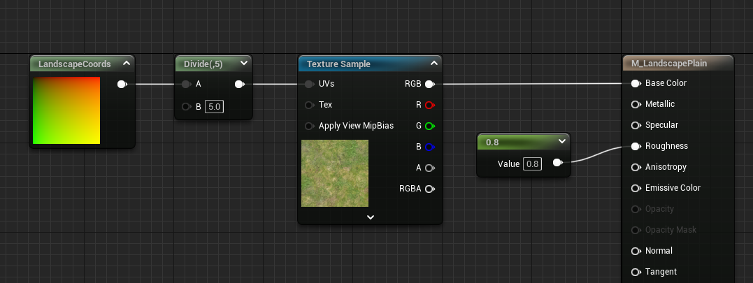
All we do here so to change the UV scale of the texture to make it larger. It’ll look great close to the player, but it’ll look repetitive as we zoom out. This is the texture from the Starter Content pack called T_Ground_Grass_D by the way.
The pack has another texture called T_MacroVariation and it’s a tileable plaster type image that can be used for what we’ll do next. We’re going to hook it up much like above with a texture coordinate, but we’ll do this three times to have three differently scaled images whose grey values we’ll overlay onto our landscape. Here’s what it looks like, trust me it’s less complicated than it looks (click to enlarge):
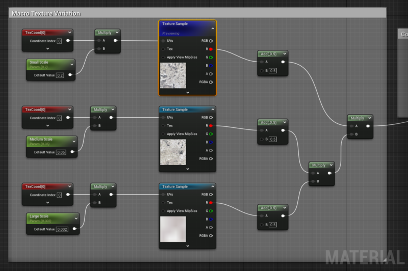
The Landscape Texture Coordinate nodes are parameters so I can drive them in a Material Instance. All of them are added and multiplied so that a single overlay can be added to my main texture in this next step, with yet another multiply node. By default the overlay would be too harsh, so we’ll soften up the contrast by halving the strength of the overlay.
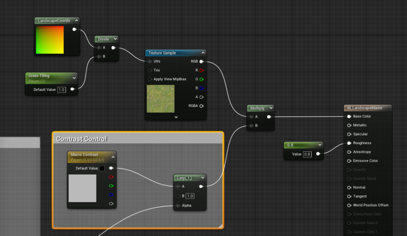
One thing of note is that we’re keeping the overlay as simple as possible by only using one colour channel instead of the RGB output. This means we’re getting plain grey values and the actual source image doesn’t matter, as it merely acts as variation breakup.
- Source: World of Level Design