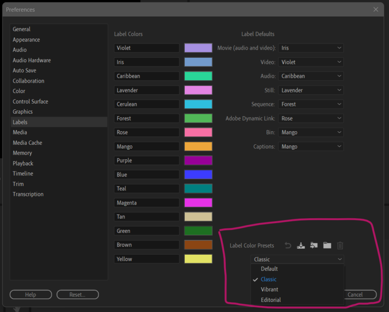

In the latest release of Premiere Pro 2024, Adobe thought it would be a great idea to “refresh” the UI colours we see in the timeline and on labels. As a long term Premiere user of nearly 30 years, those innovations annoy the living daylight out of me. I’m all for updates, but they should never be shoved down people’s throats.
I’ve reached out to Adobe about this in a tweet (or is it called an X post now?) and they very kindly told me how to switch back to “classic” mode, and I thought I’d share the knowledge. Here’s how to do it:
- head over to Preferences – Labels
- at the bottom, change from “Default” to “Classic”

I’m so glad we have this option, and I’m back in 2023 for now. Phew! Here’s my original tweet and Adobe’s answer: