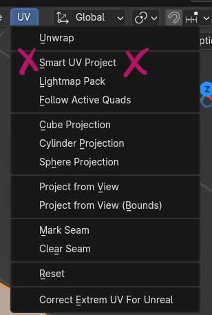
You might have been as surprised to see Smart UV Project missing at first glance in Blender 4.3. If you’re used to the menu from 4.2 and before, you had expected to see something like this:
Yet when you’re trying to use the same menu in 4.3 and above, all we see is this:
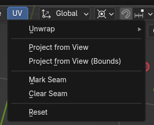
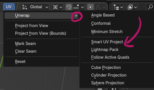
What the! Where is Smart UV Project and all the other options that once graced this menu? It’s actually staring us in the face, but if you have UI blindness (like I have), you may not notice the almost invisible new disclosure triangle next to Unwrap, which now hides the previous options in a fly-out menu. Hover over it and you’ll see all the familiar options appear next to it.
This change is both good and bad
While I appreciate the attempt to tidy up a menu every now and again, this simple change took me half an hour to find, and I’m still recovering from the shock. I briefly considered going back to an older version of Blender just to do my job. They certainly could have made that fly-out a little more noticeable. A little animation perhaps (like “this has moved”), or a splash of colour maybe? Doesn’t have to be forever, just some pointer that lets us users actually have a fighting chance of catching up with such a change in a hurry.
And hey I get it: things need a tidy up every once in a while. Ever right-clicked on a source clip in Premiere Pro? Where the context menu is so long is scrolls off the screen? Yeah, that’s what happens when you don’t do tidy things up. Awful UI design a la Adobe. We don’t want that either.
What I am saying though, Blender Devs, is this: let us know these things so we have a fighting chance to catch up. And I don’t mean “buried in a dev post” on one of your 60+ domains, I mean right there in the app, where people expect a menu item that’s been in the same place for over a decade. Think once – JUST ONCE – of the actual user.
Love and kisses from a Blender Studio and Dev Fund supporter since 2016.