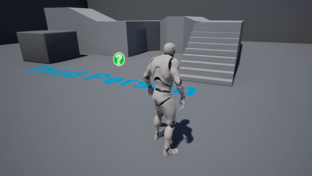
I’ve been playing with another type of menu, namely the Generic Radial Menus v2.0 by PolyHavoc (available from the Unreal Marketplace). I picked it up as a freebie when it was on offer, but the current $14.99 asking price is certainly a good deal – considering I’d have no idea where to begin writing this from scratch.
It’s a tad tricky to setup, so I thought I’d make some notes for next time. Here’s the basic principle to get this going:
- implement the Radial Input interface
- create a Widget Blueprint with an instance of the Radial Menu
- add items to the menu with an array
- add the widget to the viewport
- react to the selection
Let’s see if I can remember the details…
Add the product to your project
The first thing you’ll need to do is to add the Generic Radial Menu product to your project. It’ll install itself as a new folder. We do that from the Unreal Launcher.
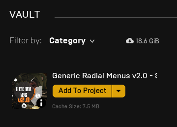
When that’s done, take a look at your Content Browser and find a folder called GenericRadialMenus.
Implementing the interface
To interact with the product, we need to implement an interface, or in other words, call a set of functions so that things can happen under the hood. The process often requires the correct parameters to be given with a function call. In this case, the joystick input. There are two ways to get started:
- we can create a new Player Controller, inheriting from the BP_RadialinputPlayerController
- or use our own (perhaps existing) Player Controller and add the interface manually
I’m using the first option here, calling my player controller MyPlayerController (how original). I’ll need to set this in my Game Mode, just as a reminder.
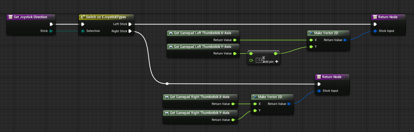
In case you’re using the second option, these are the nodes you need to add. You’ll get them by opening BP_RadialInputPlayerController, then simply copy and paste form there.
Creating the Radial Menu
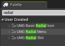
I’ll make a new Blueprint Widget, to which I’ll add a single instance of the UMG Radial Menu. It’ll come up under user created items. Search for “radial” and you’ll see the one you need. I’ll drag mine into the middle of the canvas and size it up so that it fits the screen.
I’m also going to add a Background Blur effect to the canvas, just so that the menu separates from the action a bit. Therefore I’ll set the Zorder of the menu to 1, so that the blur is behind it (otherwise my menu will be blurred in addition to the scene).
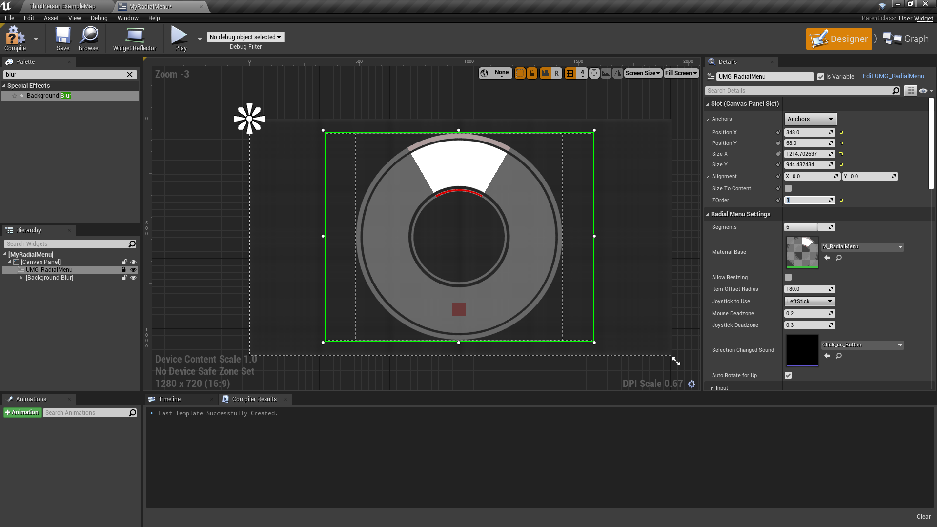
Next we need to add items to the menu using nodes. Each option is a child of UMG Basic Radial Icon Widget, so we need as many of those as we have selections in the menu. You can have as many as you like, although with more than 12 it’ll be tricky for the player to pick the right item in the circle. The Radial Menu is set to resize itself by default, thanks to the handy tick box in the Designer.
This step is a little tricky, especially when it comes to adding multiple items in the menu. Let’s start with a single one first:
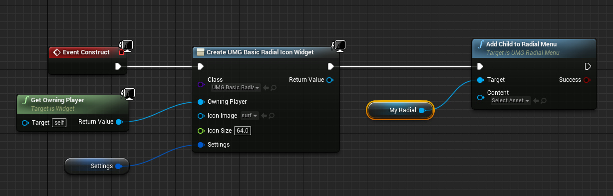
In Event Construct, we’ll create a new UMG Basic Radial Icon widget. We can specify the icon here, which would be a PNG image with transparency that you provide. This widget is then added as a child to our Radial Menu, for which I’ve grabbed a reference (My Radial). We also need to provide a reference to our owning player, and I’ve promoted Settings to a variable and aptly called it Settings. We’ll see why in the next step.
Let’s amend this code so we can add more entries to our menu. This looks a tad complicated…
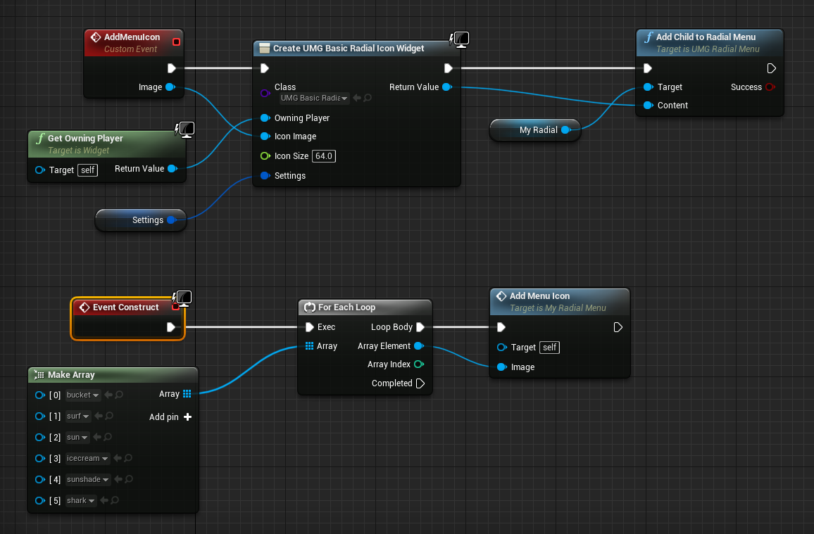
Here I’ve created an additional custom event: AddMenuIcon. This event has an input parameter of Image (a 2D Texture) so we can provide various images and create multiple widgets with it via a loop. The code does essentially what we did previously, but this time adding 6 child widgets to our selection. The bottom part is called as many times as we have icons, and the top part adds the various menu entries.
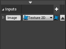
Building this as nodes is a little tricky due to some code completion oddities: I started by adding a custom event (AddMenuIcon) and added an input parameter on the left, giving it that additional pin (Image). I needed a type of Texture2D, which is what the widget icon needs as image input. After wiring it up, I’ve hooked up the For Each Loop to Event Construct. From the Array pin on the left, drag out and create a Make Array node.
This is where things get a little hairy: a Texture2D is not something Unreal Engine wants to create easily. Instead, use a Cast to Texture2D node to “prime” the array if you will. You can remove it immediately afterwards, leaving the array in Texture 2D mode, ready to select images from your project via handy drop-down menus. Here’s what it looks like at first:
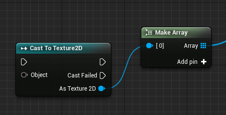
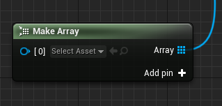
Remove the Cast node and add pins on the Make Array node to set additional images. Compile and save for good measure, then it’s on to the next step. If you don’t to this, the array won’t accept selectable Texture 2D objects.
Update the selection
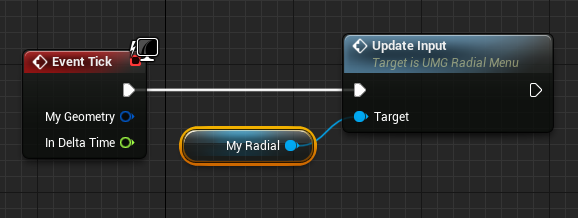
To make the widget update its selection when displayed, we need to call the Update Input method from the event tick in the widget graph. Alternatively, you could setup an Event By Timer and pick a longer interval to make selections appear. The Event Tick is more expensive to use, but has a very snappy feel to it when you scroll through the menu.
We’re done in the Widget Graph Editor for now. Congrats if you’ve made it this far! 🎉
Displaying the widget
To bring our widget into view when we need it, we’ll hook up a key press in our player controller. These radial selections are meant to be quick selection menus rather than those you dwell on for too long. As such, I’m hooking mine up so that while a key is pressed, the widget will show. When the key is released, the widget disappears again. You could implement a toggle too, but I’ll map my Tab Key as described here.
Let’s do this in our Player Controller. This may come up as a long list of menus rather than a Node Graph. If it does, choose to open the full Blueprint Editor.
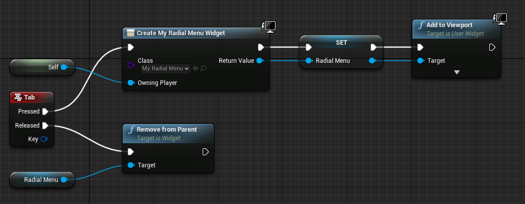
Here we use the Tab key event and create our widget when it’s pressed, set it as an accessible variable (named Radial Menu) and add it to the viewport. If the key is released, we’ll remove it from the viewport again. There’s probably a better way to do this by creating the widget once and setting its visibility rather than tearing it down and rebuilding it every time, but you get the idea.
This should make the widget come and go, complete with all our icons, but the player can still move the camera and character, which may not be what you want.
Freezing Player Controls (optional)
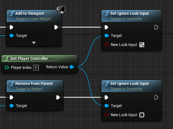
There are various ways in which we can disable player controls. I’m setting the Ignore Look Input to either true or false, depending if the button is pressed or released. This step is optional; your UI might not require a player freeze when the menu is displayed.
That’s all our basic input setup and under control. At this point the widget can be brought up, show icons, and mouse as well as gamepad movement will be able to make a selection. Hurray!
Reacting to our selection
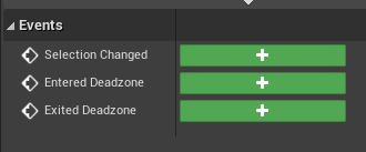
A menu isn’t any good if nothing happens when you actually select something. Let’s tackle that next. Let’s head back into the Widget Graph Editor, where there’s an event called Selection Changed. This method is called whenever the user moves to a different selection, returning the array position of the child widget. It’s a zero based array, so the first item we’ve added to our menu is “item 0”, the next one “item 1” and so forth.
We can now hook the event up and query what the user has selected, or had selected before (we get both values). I’m merely printing a string, but we could grab a reference to either the Game Mode or Player Controller and call an event there and react to it. The logic for said reaction is unlikely Widget related, so it shouldn’t go into the Widget Blueprint.
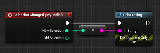
Note that the return value can be negative (-1), in case there’s no selection and no highlit item. This can happen when the player moves their mouse outside the widget, or when the gamepad enters its deadzones. Good to know that we can react to this state!
Customising your Radial Menu
The developer has given us plenty of options to make the menu our own. Let’s start with the Audio Effect that’s played when the selection changes. This is defined in the Widget Designer under Radial Menu Settings. Pick a sound file of your choice under Selection Changed Sound.
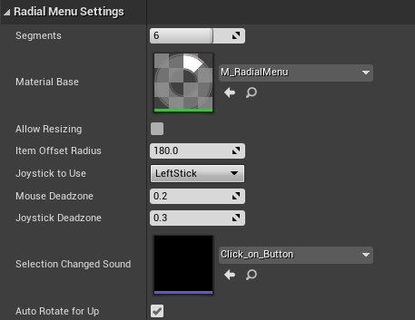
While we’re here, there are plenty of other options to play with. Auto Rotate for Up will align cells/segments so that the first one is pointing up. When disabled, the segmentation itself would point up, which is less pretty with multiple selections – but might look better if you have a 50/50 split selection.
We also get to pick which gamepad stick is used for making the selection via Joystick to Use. We even get to control the deadzones for mouse and gamepad independently (as an Xbox 360 gamepad user I very much appreciate this).
Right at the top of this window under Segments we can specify the amount of room we’d like to allocate on the menu, regardless of how many items we intend to add to it. The default option Allow Resizing would override this value by however many items we add in code. This is useful if you’d like to have a set amount of segments in your menu while updating the amount of available selections at runtime.
And finally, the Material Base texture lets us define what exactly our segmented ring should look like. We can import our own transparent files here.
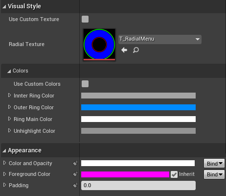
We’re not done with customisation options though! Under Visual Style we can pick a different look altogether. As far as I can make out, each colour in the Radial Texture corresponds to a key colour that can be defined under Colors. The way this works is that the green in the Radial Texture would define the outer ring, blue the inner ring and so forth. Hence we can design our own rings! Take a look at what’s included (search for “T_Radial” and see what comes up). Make sure to enable Use Custom Texture if you feel frivolous.
Aside from the the highlight colours, we can adjust the widget’s opacity (0.8 always looks nice). If you need custom colours, make sure to tick the appropriate box.
Animating the selection
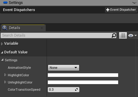
One last thing I thought was extremely cool: when an item in the menu is picked, we can animate it very subtly. It’s a bit of a “hidden feature”. Remember how we promoted the Settings of our Radial Menu in the Node/Graph Editor? Select that variable, then head over to the Details Panel on the left and take a peek under Default Value and Settings. Pick an Animation Style and see which one you prefer. I love them both 😃
Apparently we can even build multilevel selection menus with this tool, but I haven’t worked out how that works yet. If I do, you’ll be the first to find out 😉
Further Reading
- Generic Radial Menus is available on the Unreal Marketplace: https://www.unrealengine.com/marketplace/en-US/product/generic-radial-menus
- Developer Website: https://polyhavoc.com/
- Developer’s Video Tutorials: https://www.youtube.com/watch?v=IWZx-sqqsds&list=PL3KoQ3fzEMb_6LAk09t9OewrfvDg5O4sR
- Written Documentation: https://genericradialmenus.readthedocs.io/en/latest/
- Worth the asking price: YES